HTML Builder Design FAQs
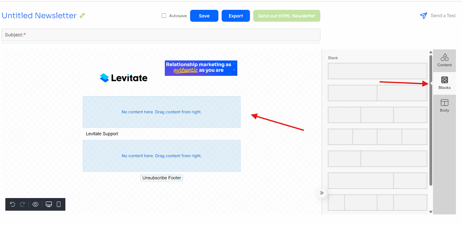
Columns
Adding Columns
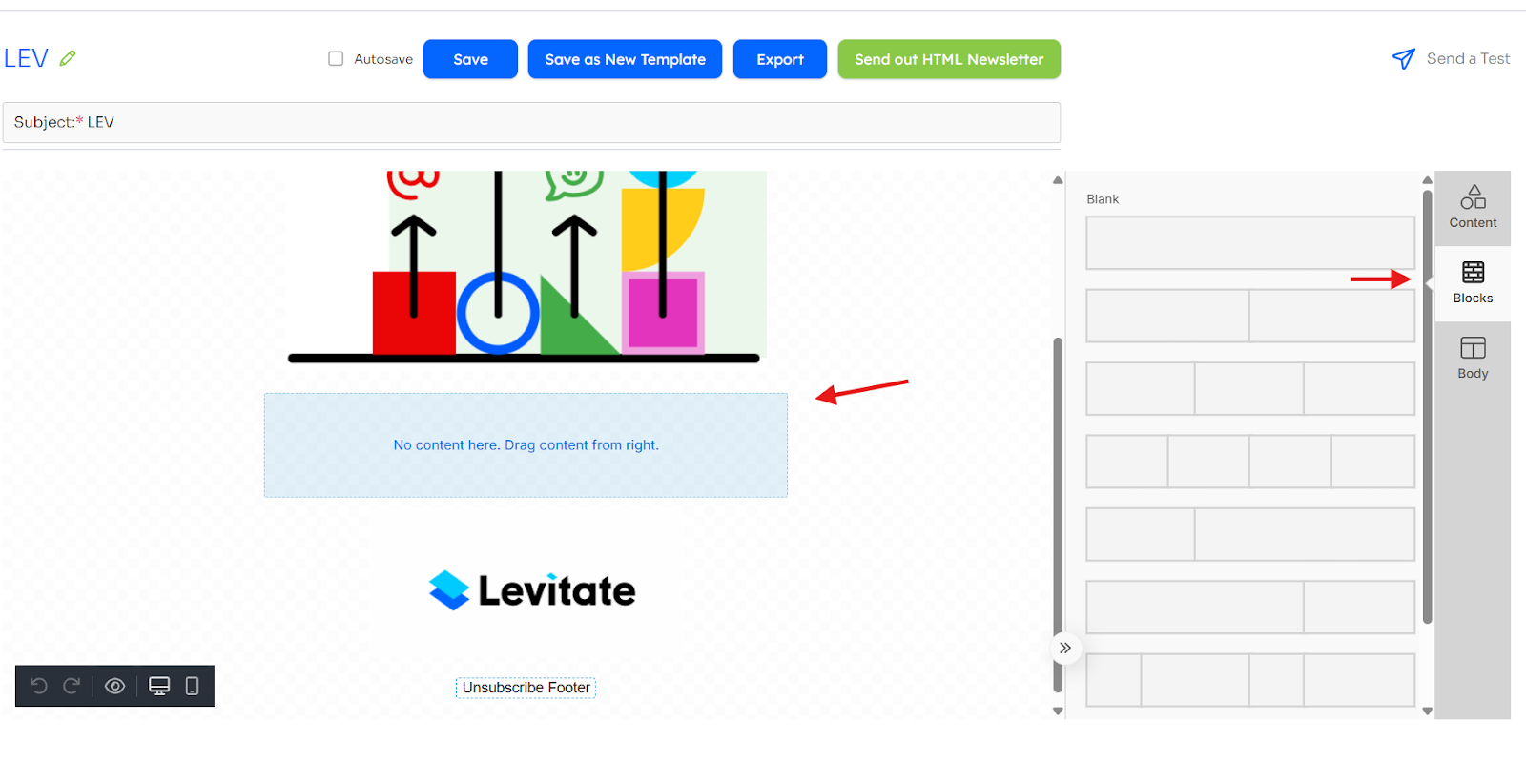
First, in a blank HTML template, you'll need to click "add content" and choose the desired amount of columns.
Please note that if you only want one column, you can just go ahead and start dragging content boxes. If you want multiple columns, follow these steps:

Once the columns are selected, you can drag and drop content. Below, I'll demonstrate a common column, text beside an image. You can then add text and upload an image of your choice.

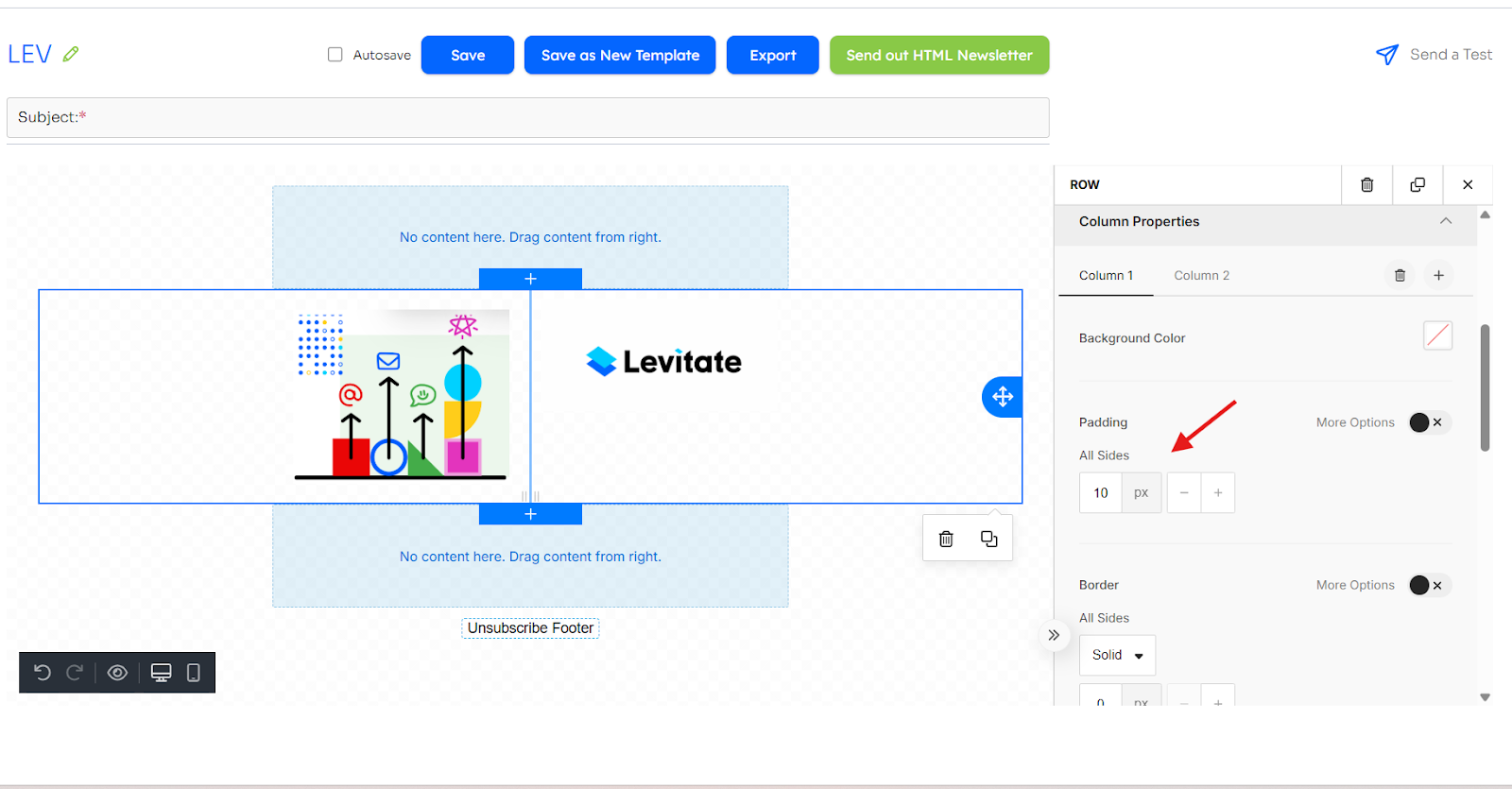
Column Properties
Background Color
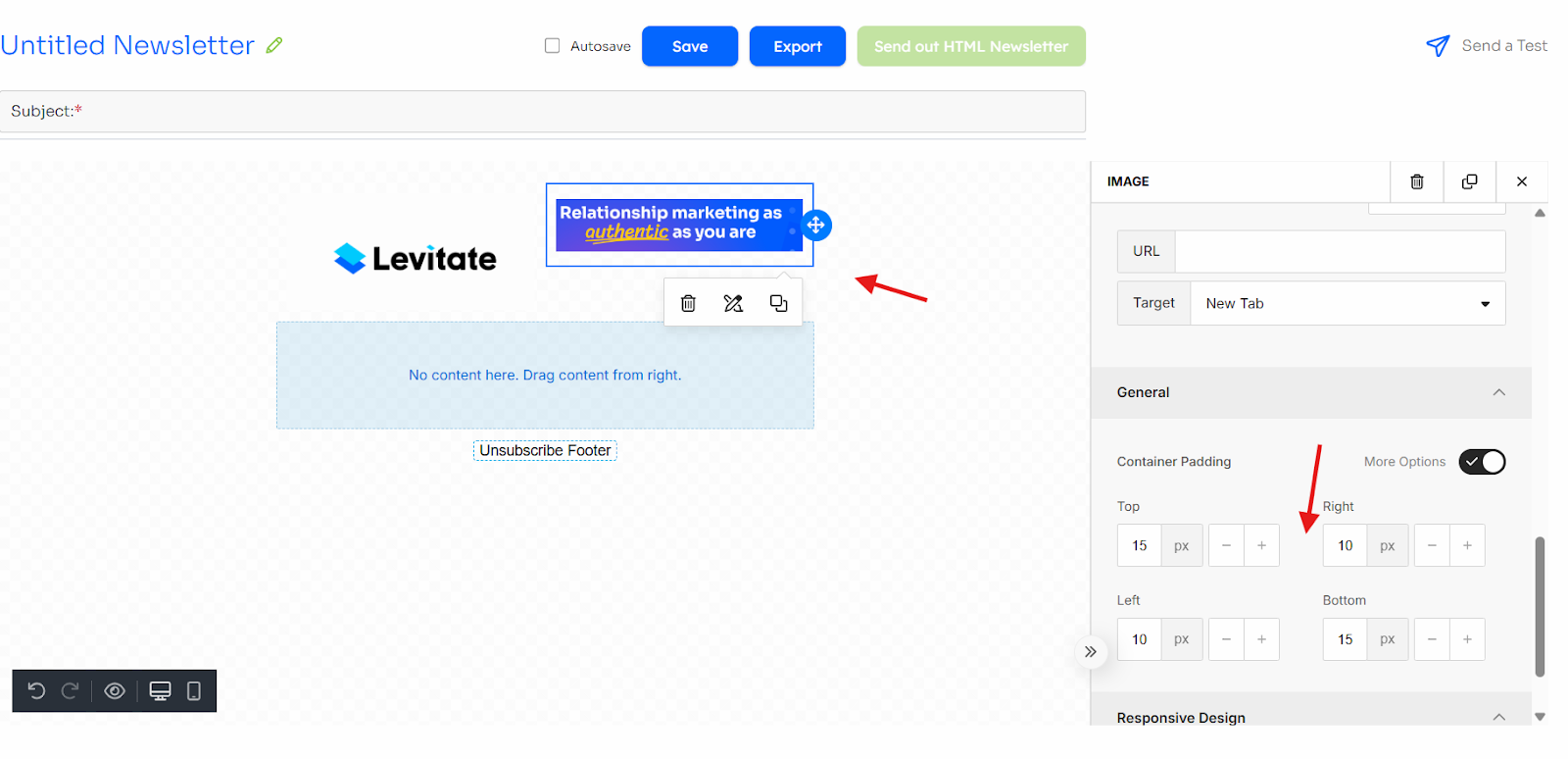
To edit column properties, you have to click outside of the content. From there, you'll see where you can edit the background color. Please note that you'll need to click the column tab to edit the different columns.

Padding
To edit padding, you can either apply the padding to all sides or click more options so that you can pick which sides the padding gets applied to.

Borders
Similar to padding, you can either apply borders to all sides or click more options to pick which sides the borders get applied to. Please note that if you're adding borders when you have multiple columns, you'll have to make one of the shared sides 0px so that the middle line isn't thicker than the other sides.

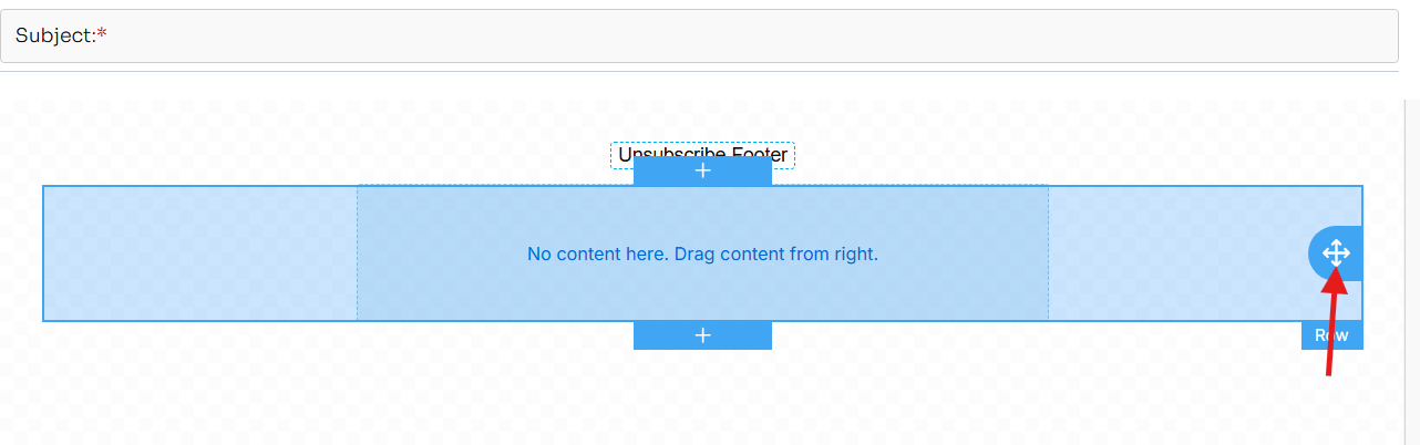
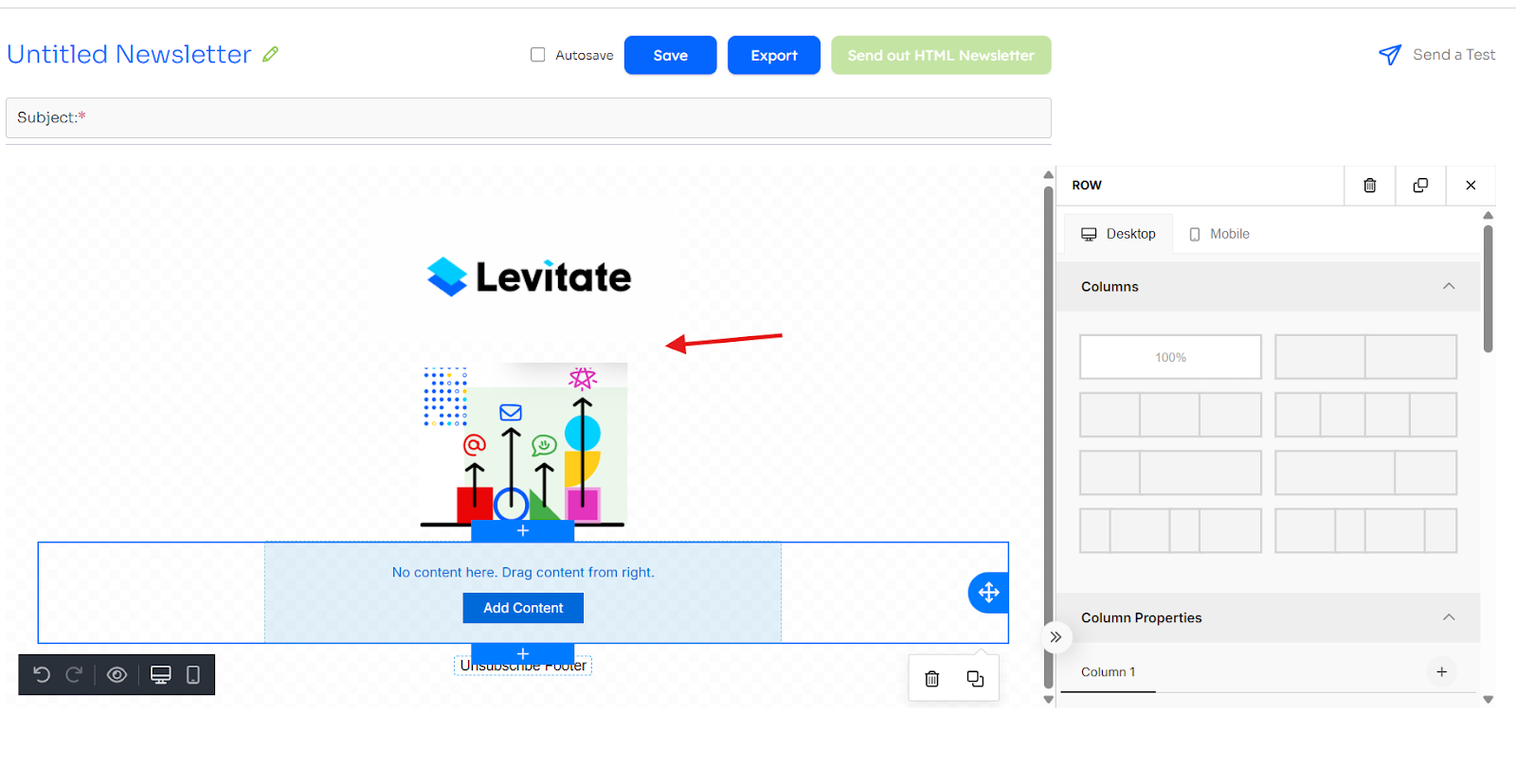
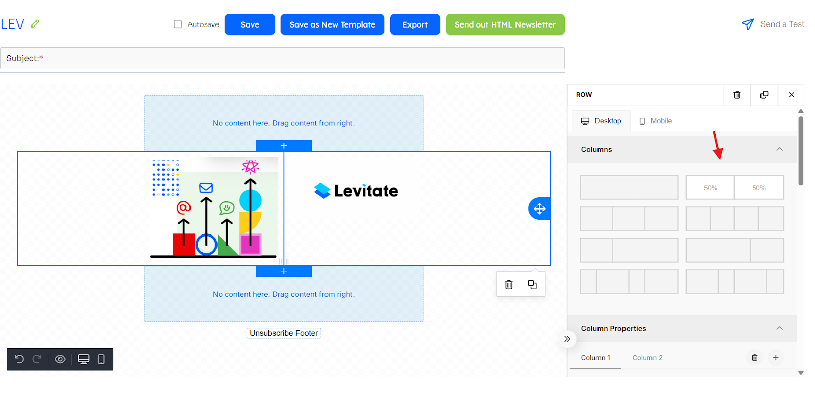
Rows
Adding Rows
When adding rows, you'll need to click the "+" icon so that you can edit the column properties. If not, you won't have the option to click the side of the content like mentioned above.

Adding Background Images
Once you have an image, click so that you get to row properties (same way as column properties, just scroll down). Then, you'll upload your image. Please note that if you'd like the image to be the same width as the rest of the content, you'll need to click content under container width.

Positioning and Moving Blocks
The Levitate HTML builder uses drag-and-drop for arranging content blocks and columns.
How to Move Columns or Blocks
- Hover over the column or block you want to move.
- A drag handle (←↕→) will appear on the right side of the column.
- Click and hold the drag handle.
- Drag the column or block to your desired location.
- A blue line will indicate where it will be placed.
- You can move blocks up or down within the same column.
- Release your mouse to drop the column or block into position.

Tips for Accurate Block Positioning
- Can't move a block? Make sure you're clicking and dragging from the drag handle (←↕→), not from the content area of the block.
- Block jumps to the wrong position? Watch for the blue drop indicator — it shows exactly where the block will land before releasing your mouse.
- Moving blocks between columns: Blocks are locked to their respective columns. To rearrange column layout, use the Layout Selector feature.
Images
Uploading Images
To add an image, first add a row. Then, you'll drag over the image from the content blocks.

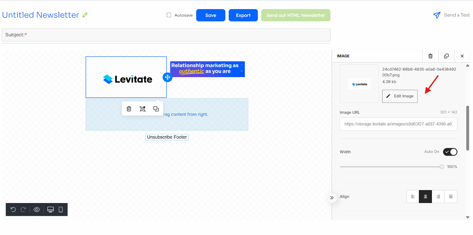
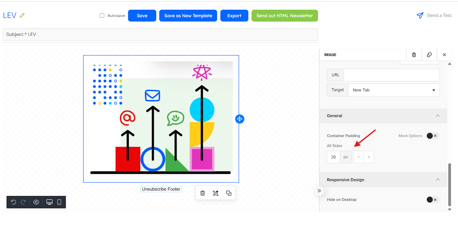
Click the image, then "upload image," and choose the desired image.

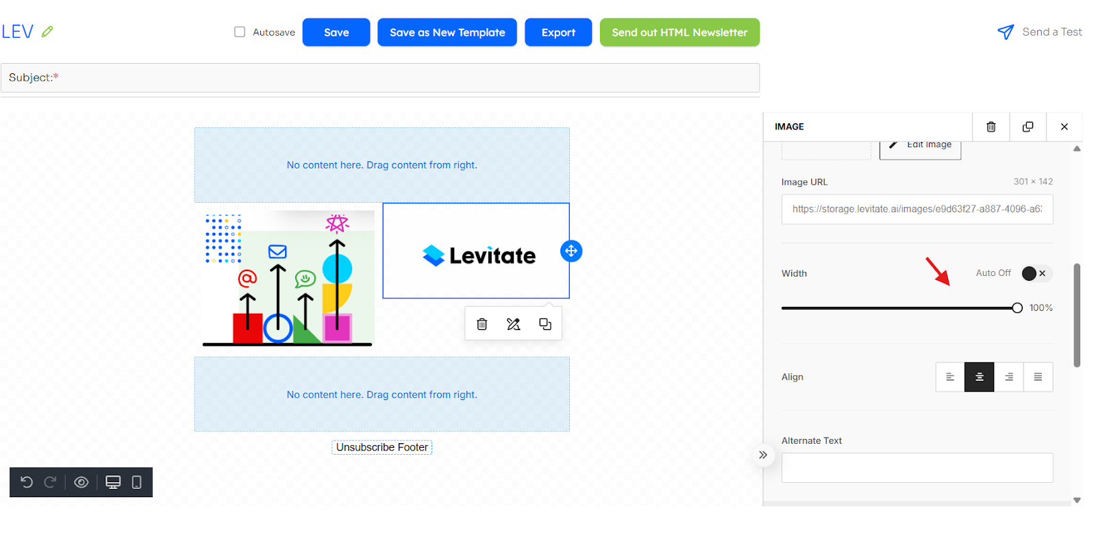
Adjusting the Width
Where it says auto width, click the button. From there, you'll have the option to change the percentage.

Adding Links
If you keep scrolling from where you uploaded the image and adjusted the width, you'll see the section where you can add links to images. From there, you'll easily be able to copy and paste the desired link.

AI Generated Images
The Levitate HTML builder doesn't support stock photos directly, but you can generate custom images using the built-in AI image generation feature.

Recommended image widths
- Single-column images: 600px wide
- Two-column images: 300px wide
- Three-column images: 200px wide
For format, resolution, and file-size guidance, see Solution 3: Reduce Image File Size below.
Troubleshooting Image Overlap
When you preview your HTML newsletter as a PDF for compliance review, you might notice images overlapping or extending beyond their containers. This happens because email clients (like Gmail and Outlook) and PDF generators use different rendering engines, so a layout that looks fine in the email preview can break in the PDF.
Common causes of image overlap
- Images that are too large for their container
- Missing or insufficient padding between elements
- Column width issues in multi-column layouts
- Absolute positioning or fixed widths
- Image dimensions not specified
Solutions
Solution 1: Set Image Width to 100%
The most common fix is to ensure images scale to fit their container. Before making changes, take a screenshot of the broken PDF preview so you have a reference to compare against.
- Click on the image in the Levitate HTML builder
- In the image properties, set Width to
100% - Click Save

Setting the width to 100% forces the image to fit within its container, preventing overflow.
Solution 2: Add Padding Around Images
Add space between images to prevent overlap:
- Select the image or content block
- In the Block Settings, find Padding
- Add padding:
- Top padding: 10-20px
- Bottom padding: 10-20px
- Left/Right padding: 5-10px (optional)
- Click Save and preview again
Solution 3: Reduce Image File Size
- Before uploading, resize images to the appropriate dimensions:
- Single-column images: 600px wide maximum
- Two-column images: 300px wide maximum
- Three-column images: 200px wide maximum
- Compress images using tools like Adobe or Wecompress
- Re-upload the optimized images to your newsletter
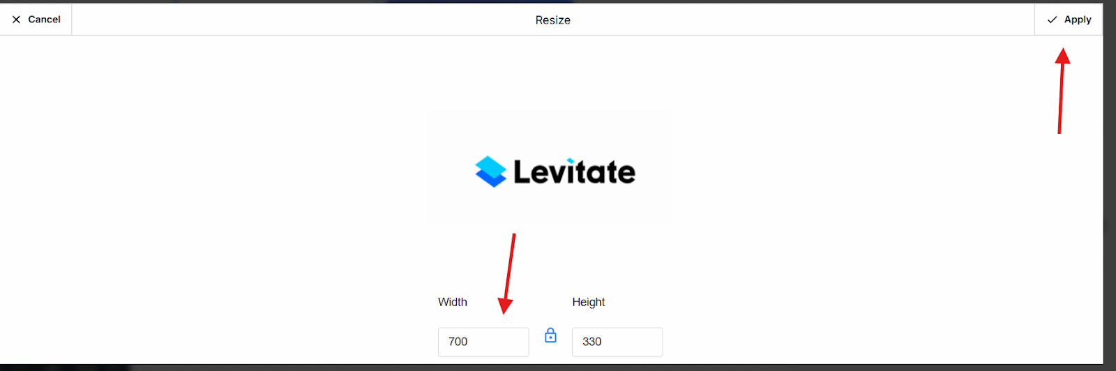
- You can also click edit image and adjust the image size after uploading the image. Adjust to 500-800 width, which will automatically adjust Height.
Recommended image specs for newsletters:
- Format: JPG or PNG (avoid GIFs for photos)
- Resolution: 72-96 DPI (higher DPI won't display better in email)
- File size: under 200KB per image (compress for faster load)
Advanced Solutions
Issue: Images Still Overlap After Basic Fixes
Advanced Fix 1: Use Spacer Blocks
Add invisible spacer blocks between content sections:
- In the Levitate HTML builder, click Add Block.
- Select Spacer from the available block types.
- Drag the spacer between the content sections that need separation.
Advanced Fix 2: Simplify Your Layout
If the newsletter has a complex layout:
- Consider simplifying to a single-column design
- Stack images vertically instead of side-by-side
- Use fewer elements per section
Common Scenarios and Fixes
Scenario 1: Two Side-by-Side Images Overlap in PDF
Cause: Column widths exceed 100% or images have fixed widths.
Fix:
- Check that columns are exactly 50% each (for 2 columns)
- Set both images to width: 100%
- Add 10px padding between columns
Scenario 2: Images Stack on Top of Each Other
Cause: Insufficient vertical spacing or missing breaks.
Fix:
- Add padding-bottom: 20px to the image block
- Insert a spacer block between images
- Ensure each image is in its own content block
Scenario 3: PDF Looks Perfect, But Email Preview Looks Wrong
Cause: Different rendering engines — the PDF generator and email clients build the layout differently, so what looks right in one can look wrong in the other.
Solution:
- Test in an actual email client by sending a test to yourself. You can also add a 'TEST' tag to your own contact profile and send to the test tag.
- Don't optimize only for PDF; ensure email looks good as well
When to Contact Support
Contact support@levitateapp.com if:
- You've tried all solutions, and images still overlap
- PDF preview consistently breaks despite correct settings
- Image overlap only happens on specific email clients
- You need help with custom HTML/CSS code
- The PDF rendering has changed suddenly
Include in your support request:
- Screenshots of the PDF showing overlap
- Screenshots of your Levitate HTML builder layout
- Image dimensions and settings
- Whether the issue occurs in the email preview or just the PDF
- Name of the HTML template
Buttons
Adding Buttons
To add a button, first add a row. Then, you'll drag over the button from the content blocks.

Editing Buttons
Click on the button and go to "button options." From there, you can edit the background color, the font, the width, and the shape.

You can also add links to each button by copying and pasting them into the URL option under "action."

Divider Lines
How to Edit
In the same way you add other content boxes, you can add a row and drag the divider content box over to add a line. From there, you can edit the line by clicking on it where you'll see options to edit the width, line type, thickness, color, and alignment.

Social Media Icons
Adding Links
You can add social media icons to HTML newsletters that link to your social media pages. To do so, drag the social content box into a new row, click on the gray icons, and click the icons you would like to link to.

From there, you can add the URLs to those social pages.

Body of HTML
Content Width and Background Color
You can edit the content width of an HTML newsletter by clicking on the body tab to the right (you'll first have to x out of any content box editing you're doing). From there, you can edit the content width and background color.

Changing Link Color
You can also change the link color if you scroll to the bottom. There, you'll see where you can edit the link color.

Mobile vs. Desktop
Previewing on Mobile
When you preview as a PDF, you're seeing the desktop view — but many of your recipients will open the email on their phone. Check both before sending:
- Generate the PDF preview to see how the desktop version renders.
- Use the "Preview on Mobile" option in the Levitate HTML builder to see how it stacks on a phone.
- If anything looks off on mobile, set images to
max-width: 100%so they scale down, and check the Controlling stacking section below.
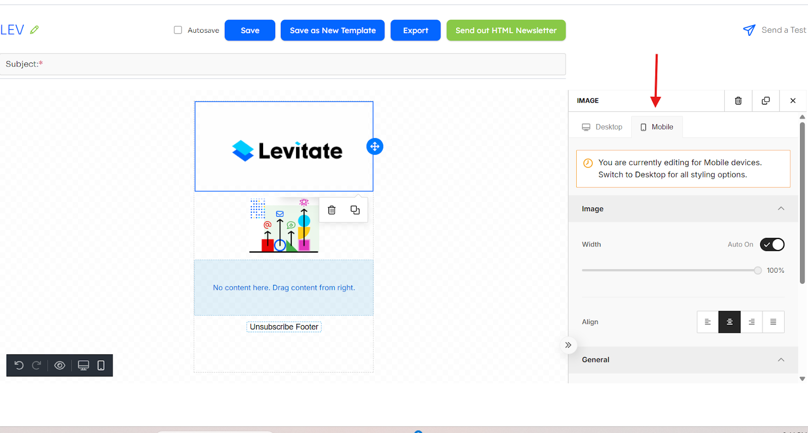
Controlling stacking
By default, columns stack on top of each other on mobile. To override that behavior, click into the column properties and choose the mobile tab.

Then, scroll down, and choose "Do Not Stack on Mobile"

Please note that editing under the mobile tab can change the desktop formatting, so make sure to switch between the two.
FAQs
Q: How do I move a block to the top of my newsletter?
A: Drag the block upward until the blue line appears at the top of your column, then release your mouse. This places the block at the top position.
Q: Can I drag blocks between sections?
A: Yes. Blocks can only be moved within their current section. To move content between sections, recreate the block in the target section and copy your content into it.
Q: Why won't my image block move where I want it?
A: This usually happens due to browser lag or draft errors. Try refreshing the page, reopening your draft, and ensuring you're using the drag handle rather than the image itself.
Q: I'm getting an error when editing or saving my HTML newsletter. What should I do?
A: Try undoing recent changes, clearing your browser cache, or using Chrome. If you pasted content from another source, try retyping it directly. Contact support if the error persists.
Q: I'm getting an error about enabling storage or registering image callback. What does this mean?
A: This is typically a temporary error. Try refreshing the page and uploading again. If it persists, contact Levitate support.
Q: I'm trying to upload a photo to my HTML newsletter but it just shows a spinning wheel and never finishes. What should I do?
A: A spinning wheel that never resolves usually means the image upload timed out or was rejected by the server. Try these steps in order:
- Reduce the file size. Large images are the most common cause. Compress the image using a tool like Wecompress or Adobe Express and keep each image under 1 MB before uploading. Supported formats are JPG, PNG, and GIF.
- Check the file type. Only image files (JPG, PNG, GIF) are accepted. If you are trying to upload a HEIC, WEBP, or other format, convert it to JPG or PNG first.
- Refresh the page and try again. A temporary network issue can cause a one-time stall. Reload the HTML builder, reopen your draft, and attempt the upload again.
- Try a different browser. Chrome is recommended. If you are on Safari or Firefox and the problem persists, switch to Chrome.
Note: The HTML builder automatically resizes uploaded images to fit the newsletter. Very large files (over a few MB) may time out before that processing completes, which is why reducing the file size before uploading is the most reliable fix.
Q: I uploaded a photo to my HTML newsletter and it seemed to work, but now the image is gone and the image placeholder has also disappeared. What happened?
A: When an image upload fails silently, the editor may remove the placeholder along with the failed image. This can happen if the upload timed out or was rejected (for example, due to a large file size or unsupported format) before the image URL was saved.
To recover:
- Re-add an image block to your layout by dragging the image content block into the row where the placeholder was.
- Compress your image to under 1 MB and confirm it is a JPG or PNG before re-uploading.
- Click Upload Image and select the compressed file.
- Save the template once the image appears correctly.
If the image block continues to disappear after saving, contact support@levitateapp.com and include the template name and a description of the image you are trying to upload.